Building Kshira Organics’ Shelf Impact
Through Packaging Design
Building Kshira Organics’ Shelf Impact
Through Packaging Design
7+
Packaging Variants
Fully
Consistent Brand System
100%
Print-Ready Artwork
The
Background
Kshira Organics is an Indian FMCG brand offering natural food products, including wood-pressed oils and premium spices. Its product range includes white sesame oil, black sesame oil, yellow mustard oil, black mustard oil, groundnut oil, almond oil and chilli powder.
The brand required a packaging identity that could communicate purity, traditional processing and premium quality. Every product needed a distinct appearance while remaining connected through one consistent visual system.
The packaging also had to work effectively across different formats, including tall glass bottles and stand-up pouches.
The
Challange
The main challenge was to create packaging for multiple product categories without losing consistency across the complete Kshira Organics range.
Each product required clear ingredient imagery, product benefits and important information. The designs also needed to communicate the brand’s natural positioning while remaining attractive, readable and suitable for retail shelves and online marketplaces.
Key Packaging Challenges
Creating consistency across oils and spices
Designing for bottles and stand-up pouches
Making every product easy to identify
Communicating natural and traditional processing
Organising product benefits clearly
Maintaining readability on different package sizes
Improving retail and online product visibility
Preparing accurate artwork for printing
The
Approach
We developed a clean and flexible packaging system centred around the natural positioning of Kshira Organics.
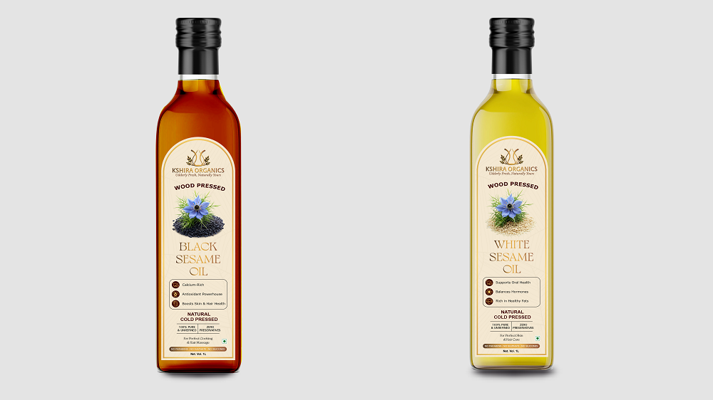
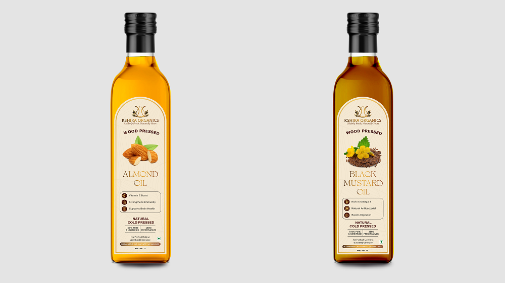
A soft cream colour palette, warm golden details and premium typography were used to create an organic and trustworthy appearance. Each oil label followed the same structure while using different ingredient illustrations and product names for easier identification.
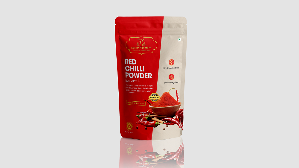
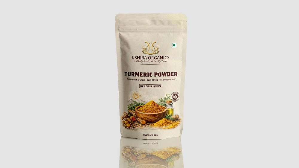
For the spice packaging, bold product imagery and stronger colour contrasts were used to improve visibility while maintaining the brand’s overall visual identity.
Key Design Decisions
Positioned the Kshira Organics logo prominently
Used a warm and natural colour palette
Created clear and readable product names
Added realistic ingredient illustrations
Maintained consistency across all oil labels
Used product-specific colours and imagery
Highlighted key product benefits clearly
Designed layouts for bottles and pouches
Created realistic packaging mockups
Prepared professional print-ready artwork
Ready to Make Your Product Stand Out?
Create memorable FMCG packaging that communicates quality, attracts customers and strengthens your brand identity.
We created a complete packaging design system for Kshira Organics’ oils and spice products.
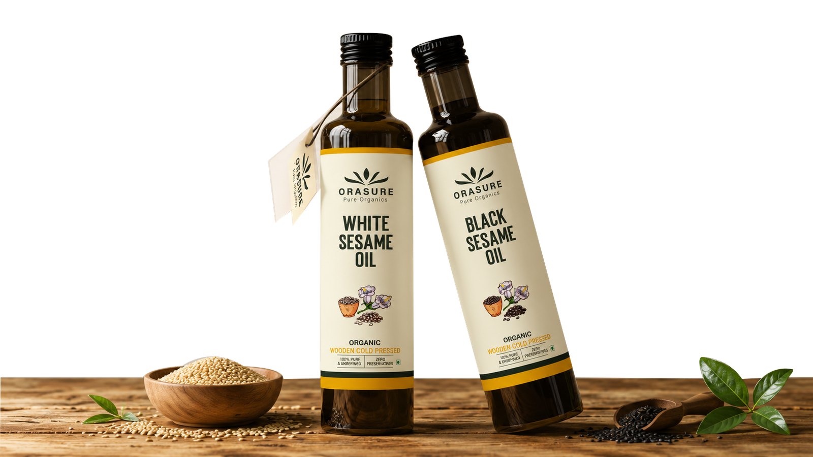
The oil labels use a clean cream base with golden borders, natural ingredient visuals and structured product information. This gives the range a premium appearance while making every oil variant easy to recognise.
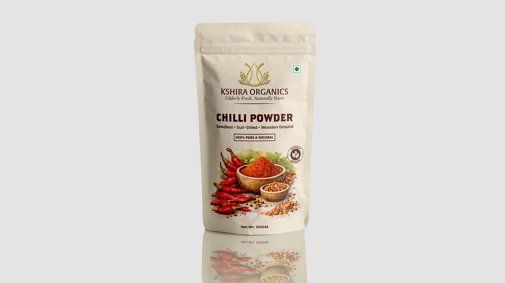
The chilli powder pouch uses bold ingredient photography and clear typography to create stronger shelf visibility. The layout maintains the natural character of the brand while presenting the product name, quality message and net weight clearly.
Every design was created to maintain consistency across the range while allowing each product to have its own visual identity.
What We Delivered
Complete FMCG packaging design system
Wood-pressed oil label designs
White sesame oil packaging
Black sesame oil packaging
Yellow mustard oil packaging
Black mustard oil packaging
Groundnut oil packaging
Almond oil packaging
Chilli powder pouch design
Product benefit icon placement
Ingredient-based visual elements
Consistent typography and colour system
Realistic product mockups
Print-ready packaging artwork
"Our focus was to create packaging that feels natural, premium and instantly recognisable across every Kshira Organics product."
The
Result
Stronger Kshira Organics brand identity
Better differentiation between products
Improved shelf and online visibility
Clearer product information hierarchy
Consistent appearance across bottles and pouches
Stronger natural and premium positioning
Easier customer recognition
Scalable packaging system for future products
Production-ready packaging artwork
"The new packaging system gave every Kshira Organics product a distinct identity while connecting the complete range through one consistent visual language."