
Packaging Design

FMCG

India

Building Orasure’s Shelf Impact
Through Packaging Design

Building Orasure’s Shelf Impact Through Packaging Design

7+

Product Packaging Variants

Fully

Unified Packaging System

100%

Print-Ready Artwork

The Background

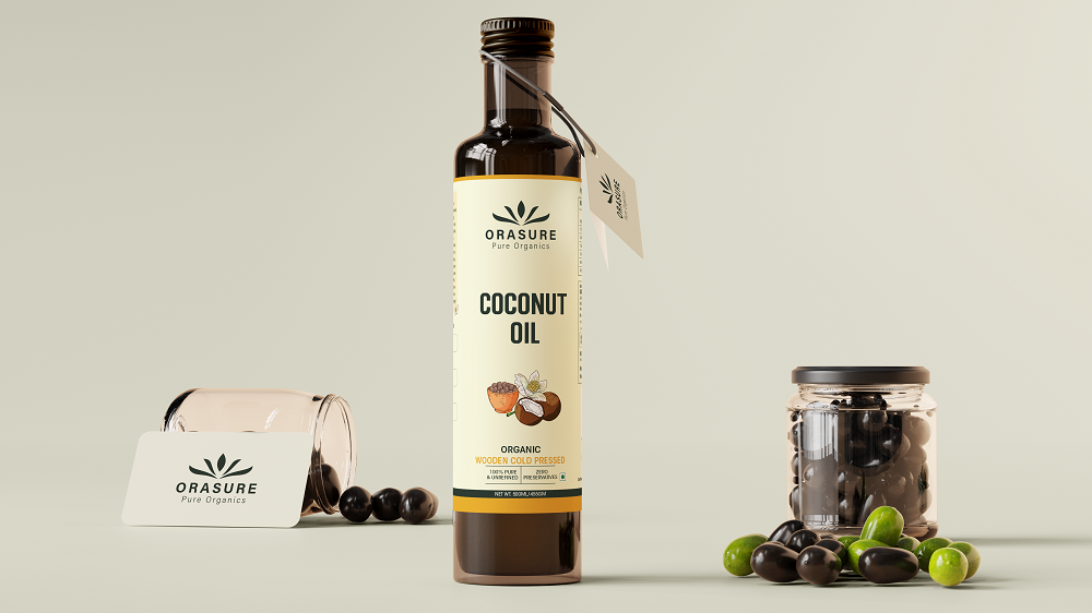
Orasure is an Indian FMCG brand offering a range of pure and organic cooking oils. Its product collection includes coconut oil, groundnut oil, black mustard oil, yellow mustard oil, white sesame oil and black sesame oil.

The brand required a packaging identity that could communicate purity, natural ingredients and product quality at first glance. It also needed a consistent design system that could be easily adapted across multiple oil variants while keeping every product clearly identifiable.

For an FMCG product, packaging is not only used to protect the product. It also helps attract attention, build customer trust and influence buying decisions.

The Challange

The main challenge was to create packaging that looked natural and premium while remaining simple, informative and easy to understand.

Since Orasure offered several oil varieties, every label needed its own identity without losing overall brand consistency. Important information such as the product name, oil type, organic positioning and product details also needed to remain clearly visible.


Key Packaging Challenges:
  • Creating a consistent look across multiple products
  • Communicating purity and organic quality
  • Making each oil variant easy to identify
  • Organising product information clearly
  • Building stronger shelf visibility
  • Maintaining readable text at different label sizes
  • Preparing artwork suitable for professional printing

The Approach

We followed a brand-focused packaging design approach built around clarity, consistency and natural product appeal.

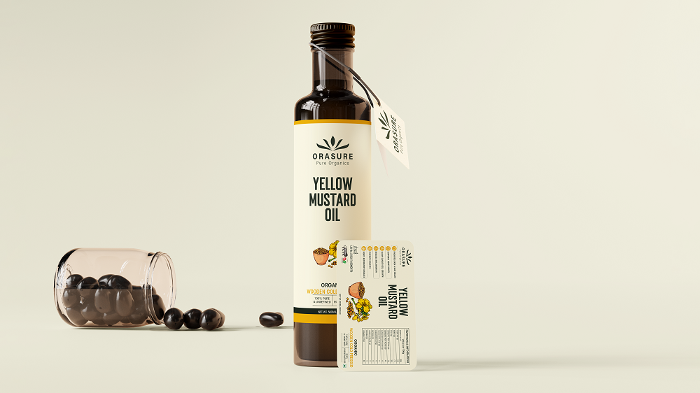
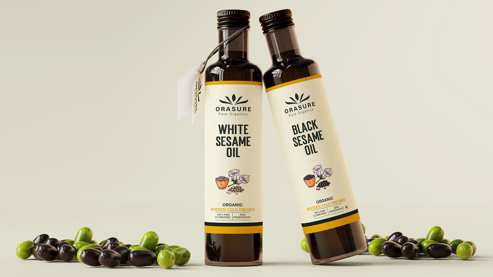
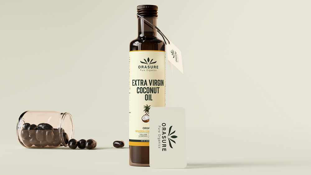
The existing Orasure logo became the central part of the packaging. We used a soft cream background, deep green typography and warm yellow accents to create a natural and premium appearance.

A common label structure was developed for every oil variant. Product names, illustrations and supporting information were changed according to each product while the overall layout remained consistent.


Key Design Decisions:
  • Used the Orasure logo prominently
  • Selected a clean and natural colour palette
  • Created bold and readable product names
  • Added ingredient-based product illustrations
  • Maintained the same layout across all variants
  • Used colour accents for easier differentiation
  • Balanced branding with essential information
  • Created realistic mockups for presentation
  • Prepared print-ready packaging artwork

Ready to Make Your Product Stand Out?

Let us create attractive packaging that builds customer trust, improves shelf presence and strengthens your brand identity.

The Solution

We created a flexible packaging and label design system for the complete Orasure organic oil range.

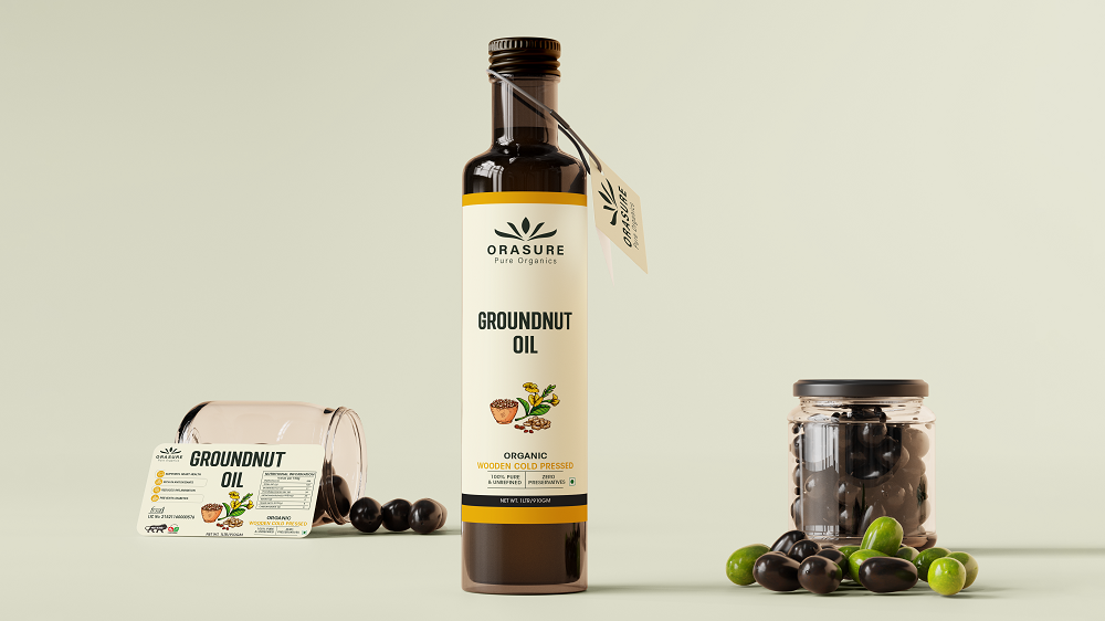
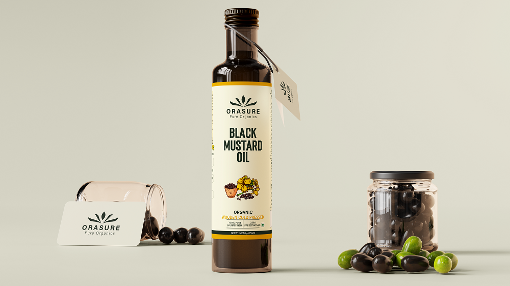
Every label follows the same visual structure to make the brand instantly recognisable. The Orasure logo appears clearly at the top, followed by a bold product name and a simple ingredient illustration.

The cream-coloured label supports the brand’s natural positioning, while dark green and yellow accents create contrast and improve readability. Each product variant has its own name and ingredient visuals, making it easier for customers to identify the right oil.

The packaging design was developed to work consistently across bottles, product tags, front labels and informational panels.


What We Delivered:
  • Complete FMCG packaging design system
  • Organic cooking oil label designs
  • Multiple product packaging variants
  • Front and back label layouts
  • Product information hierarchy
  • Ingredient illustrations and visual elements
  • Consistent typography and colour system
  • Bottle tag design
  • Print-ready packaging artwork
  • Realistic product packaging mockups
  • Scalable design template for future products

"Our focus was to create packaging that looks pure, premium and instantly recognisable across every Orasure product."

The Result

  • Stronger and more consistent brand identity
  • Better visibility across product variants
  • Clearer communication of product type
  • Premium and natural shelf appearance
  • Improved packaging consistency
  • Easier product recognition
  • Print-ready designs for production
  • Scalable system for future FMCG products

"The new packaging system gave every Orasure product its own identity while keeping the complete range connected through one strong visual language."

Explore other
outcomes like these

Kshira Organics

FMCG
Elevating Natural Products Through Premium Packaging Design

India

Majestic Ira

FMCG

Creating Premium Shelf Appeal Through Packaging Design

India

Holstein

Animal Feed

Building Trust Through Powerful Animal Feed Packaging

USA

Claim FREE Domain & Rewards Worth $1000+

Get a FREE domain and Exclusive Premium Plugins & Themes (personally sent by us) when you take cheap & fast hosting today. Don’t miss out!